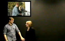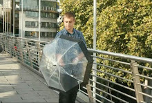
During the last week before we broke up,we finally finished the last parts of our video that seemed to take forever to do! A split screen has been used for the beginning and end as planned. It doesnt look brilliant, but i think it still works ok.
Now everyones going to screen their music videos to the rest of the class, to get some audience feedback, so once everyone has commented i can document what they thought on here.
Monday, 22 February 2010

Friday, 12 February 2010
Poster

as were far into the project now i understand who the band our and what they're about. I wanted to do my digipack seperate to hannah because i have the freedom to do whatever i like and in my own time. I spent some time doing my poster choosing the right colours, layering, playing around with pictures of the band because i just love photoshop :) I ensured i had the title of the cd, the band, the release date and some featured songs on the album. I also added their record label, Island Records, and a recommendation from NME, for further promotion.
Monday, 8 February 2010
My CD Cover :)

This is the album for The crimson Cucumbers. Fortunatly, most of the music video is photo animated so i had a couple of hundred photographs to choose from! I think its important that the band appear on the front in "cut out" filter style which is used in the video. The audience will see the band members and also be reminded of their newest release. Ive included two video stills of the protagonist James, looking out onto the river thames and also walking along the southbank to give a sense of location as The cucumbers are a london band. I later discovered that the album cover needs space for 2 disks- the cd and the dvd. So ill go onto doing that now...
Saturday, 30 January 2010
damn silhouettes...
In total annoyance, the footage of Ross, George, and Kirsty was partly filmed length ways to get fit their whole bodys in a portrait position, but once uploaded it meant that they were flipped 270 degrees so they are standing on the left side of the screen :(
so that meant only parts where they were upright could be used. Trying to find a silhouette effect wasnt easy and we are still not totally convinced with what we've chosen. An effect called "edges" on i-movie whereby the outlines of a chosen subject glows and everything else is blackout. It worked in the way that their mouths are obscured )because they werent singing the correct lyrics) but doesnt look brilliant.
So we probably will be doing this again and hopefully get an actualy silhouette by placing the light behind their faces or creating shadows. We need clear wall, a dark room and a big light! (and help from George Ross and kirsty :P)
so that meant only parts where they were upright could be used. Trying to find a silhouette effect wasnt easy and we are still not totally convinced with what we've chosen. An effect called "edges" on i-movie whereby the outlines of a chosen subject glows and everything else is blackout. It worked in the way that their mouths are obscured )because they werent singing the correct lyrics) but doesnt look brilliant.
So we probably will be doing this again and hopefully get an actualy silhouette by placing the light behind their faces or creating shadows. We need clear wall, a dark room and a big light! (and help from George Ross and kirsty :P)
Tuesday, 26 January 2010
Digipack...CD Covers
The CD cover/poster is an essential part of poduction for a band so for my Digipack, i looked at other album art that i was interested in. Ladyhawke's album was released in 2008 and by the same record company as my band, The Crimson Cucumbers. I really like the colourful artistry on the front. Its very playful and looks hand drawn. I also like the simplicity of the typography.

Passion Pit is the band who produced the record sung by my band, Moth's wings, and is the title of the album i'm currently making. This is Passion Pit's second album Chunk of Change. I like the abstract geometric lines which i may use in my cd cover or poster. Apart from that, the cover is rather simple :)It important that i look at cd covers of a fellow Indie band to make my own realistic as possible.

Elton John is another great artist who has a very colourful and arty cover. These wacky images run right through his "Captain Fantastic" album into his book inside. As an a member of the public, i like owning this cd because of the music and interesting artwork. It wouldnt be the same if i had downloaded it which is what is happened in this day and age of music.


Passion Pit is the band who produced the record sung by my band, Moth's wings, and is the title of the album i'm currently making. This is Passion Pit's second album Chunk of Change. I like the abstract geometric lines which i may use in my cd cover or poster. Apart from that, the cover is rather simple :)It important that i look at cd covers of a fellow Indie band to make my own realistic as possible.

Elton John is another great artist who has a very colourful and arty cover. These wacky images run right through his "Captain Fantastic" album into his book inside. As an a member of the public, i like owning this cd because of the music and interesting artwork. It wouldnt be the same if i had downloaded it which is what is happened in this day and age of music.

Thursday, 14 January 2010
Our ideas on screen
The pop up style beginning is finally finished !the whole process was done photoshop, finding images of london landmarks, shops, people, objects etc, filtering them onto cut out and layering them ontop of one another.

The umbrella sequence starts at the end of the pop up and beginning of the photo animation.The cardboard cut out look shows james standing on the bridge which then cuts to james (in real life) like this


An additional thing we added whilst on photoshop was a colour fade on James walking. The photo starts in black and white and as he moves across from left to right, the colour moves with him. its as if he brings life to the shot The sihlouette effect we wanted didnt work out to well but we tried out an effect on imovie which we think works well. You can still see the outline of George.
 And adding to that we made george x5!


The umbrella sequence starts at the end of the pop up and beginning of the photo animation.The cardboard cut out look shows james standing on the bridge which then cuts to james (in real life) like this


An additional thing we added whilst on photoshop was a colour fade on James walking. The photo starts in black and white and as he moves across from left to right, the colour moves with him. its as if he brings life to the shot
 The sihlouette effect we wanted didnt work out to well but we tried out an effect on imovie which we think works well. You can still see the outline of George.
 And adding to that we made george x5!
Tuesday, 5 January 2010
IT'S ALIVE!!
Weve got quite far with the video now. Ive finished creating the instrumental scene, on photoshop where moths fly onto the screen and fly around in circles. It took a while because there was so many moths at a given time and these moths had to be moved onto the every picture and put into a different position each time to create flowing animation. Each moth was put on one at at time and moved. Eventually i found a way to merge the moths toegther as a group and move them as one layer; it saved me some time :)


Subscribe to:
Posts (Atom)