Looking at all of The Radio Dept.'s abums as a whole they do keep a similar theme going, even when they are released years down the line. The band name is always either in the corners or like Pet Grief, at the top. The album title is then printed in a smaller font underneath it. The images chosen for the album do look a lilttle random but often envolve people. It is unlcear whether it is the band or not. I Artists havnt exactly promoted themselves but the name. Its all about "The radio Dept." not the members in it. The relaxed style of music does compliment the album covers which look dreamy and quite simple. Although the single "Freddie and the Trojan Horse" has a dead animal on the front, it looks calm and deserted. Ive also noticed that the titles of the albums/singles dont really have any reference to the picture in the background, again showing that its about the brand name. The albums have an arty theme and black and white images are a common feature.
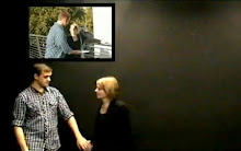
The Radio Dept. -The Worst taste in music : this video combines film, and photography.
Thursday, 9 July 2009
Subscribe to:
Post Comments (Atom)


No comments:
Post a Comment