Tuesday 30 March 2010

Evaluation Presentation


1. In what ways does your media product use, develop or challenge forms and conventions of real media products?
Indie band videos tend to focus on a performance and have no real narrative. Some are also experiemetnal and as named, independant. However we decided to challenge these conventions by taking the focus off the band and concentrating on the overall look of the video, which is quite arty. We didn’t feel it was necessary to show the identity of the band because this was going to be “The Crimson Cucumber’s” third hit single; they have already established their place within the music industry. I took inspiration from The Radio Dept.'s animated video "Pulling Our Weight" where the band are not featured. Also The Avalanches videos that i reasearched do not feature the artists.
The Video has a beginning, middle, and end which follows the conventions of most music videos. It also goes full circle, ending how it started. We did follow the conventions of an indie video by having a weak narrative. There is a little romance story in the video but its subtle.

2. How effective is the combination of your main product and ancillary texts?

We wanted the style of the video to follow though with the digi packs, to further promote the band. As the video was predominantly photos, we used these to make the posters. The photos we used were of the band so that the audience will recognise them and be reminded of their newest song and video. This will help especially when their audience are looking for the band’s CD in the shops and it also encourages them to buy the CD because of the artwork. The style we've chosen runs through the music video, cd cover, and posters to keep our theme going. The band will become identifiyable and recognisable. The carefree colourful pictures would appeal to out target audience and reflect their style/chacracter. I think the band could also gain a wider appeal from their simple and playful images.

It is important to have the posters and CD covers alongside the release of the new song so the band can gain a mass audience and they can be plugged on music channels, chat shows etc.


3. What have you learned from your audience feedback?
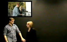
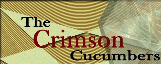
In the initial crit, we presented the mood board of band. The class liked our band name of "The Crimson Cucumbers" because it is unique and totally spontanious. We explained that we went along the idea of "The Arctic Monkeys," putting two random words together. During the pitch, the class commented on the photographs we had taken which appear at the start of the video. They liked the location and the suuny lighting on the the shoot. overall the music video recieved positive comments.People enjoyed watching the video because it is photo animated unlike most most music videos today and we also tapping along to catchy song which i think is important because it shows our band's image and genre of music appeal to our target audience. At the pitch we described how during the editing stages, the video will eventually rewind all the way back to the start for narrative sake (all the photographs of James walking will reverse so James meets back up with the girl he meets at the very start). The class seemed a bit annoyed that we would only have to make half a video and cheat by repeating what we already had. However during our first screening they didn't mind because the video lasts around 4 minutes so we had created about 3 mintues worth of footage before reusing shots we had. A few weeks before the deadline we had another feeback/ screening lesson so that any last adjustments can be made and the class had said that the contrast could be tweaked to make things look more professional and we took this advice and did it. I think it looks a lot better now.I created two posters and i wasnt sure which one to go, but during the evaluation crit a few members of the class commented on my second poster and liked the simplisity of it, but also the effect of having images repeated as if they are moving. The video is now on youtube! We have recieved a comment at the moment. The Video is uploaded on my account but im going to upload it onto the school's account "Teamedia" so the school students can watch it and hopefully we can recieve comments from the media and film students and the sixth form.

4. How did you use new media technologies in the construction and research, planning and evaluation stages?
New media technology played an important role with every stage of this project. It easily accesible to research band/artists online because you can find their own social networking websites on myspace/facebook/ twitter and find their style and who their target audience is. Youtube let me watch and analyse my favourite music videos, videos from my case study artist and also videos from the indie rock genre. Although it wasnt entirely useful, Glogster was a fun way to express what type of music you like online, just like creating a poster. I did realise that Glogster do have a kind of community whereby anyone can sign up and create a glog showing their passion for music, film etc. it alsos you to pick your own designs, paste pictures,add text and upload music so it's totally interactive. The happen to love blogging more so than doing a sketchbook because the project involves NMT. This way i could upload videos straight to my blog, show our animatic, add photos from the day, and document each step like a diary which made the whole process more enjoyable (being a teenager its what we are used to really) Although temperamental and very frsutrating, the apple Macs made the video what it is now with its software which is suited for media/ music compnaies.Most of the video was made on I-movie because that's the program we are acustomed to. We used the effects on I-movie on the footage of the band singing along to the music, and the software made uploading all our photographs and easier task. Final tweaks we used on Final cut because it is a more advanced. On here we added a splitscreen to the opening which we couldn't of done on I-movie. We also the adjusted the colours and contrast which i mentioned earlier. I created my posters on photoshop because it has a range of tools to crop, add effects,add text and be able to move layers one at a time. Even i-pods/mp3s came in handy when filming on location because the music is portable and can play aloud for the actors to hear.


Monday 15 March 2010

Feedback


a comment on youtube!

Monday 8 March 2010

The Crimson Cucumbers- Moth's Wings Final cut

http://www.youtube.com/watch?v=HYG2xQkrHac


yay the crimson cucumbers have made it to youtube!
This is the final cut of the music video, Moth's wings. Now its open to the public and to other media students we can hopefully get feedback. Im happy it's finally finished!

Friday 5 March 2010

Poster no.2


On the off chance, i made a second poster to promote the band. It is more simplistic than the first and it still has the necessary details the audience need to know. The colour scheme and theme from the video still runs through.

Monday 1 March 2010

CD/DVD Cover


ive altered my original 4 panel cd cover and added more photos of the band to a new template now with 6 pannels.I used the same colours and tones of cream, blue,and brown on all panels so the cd is cohesive. The Cd and Dvd will fit in the top 2 panels on the left. On one ive chosen colours and patterns to match my first poster. Ive included the(all important) moths and also the umbrella which is the first object you see between the transtition of the collage and real life imagery. On the inside cover the band members George, Kirsty and Ross have been cut and pasted in from the photos using photoshop.These were photos we took whilst shooting of the band dancing around having fun. They came in handy after all! Beneath their pictures there is a thank you message to friends family and fans, like a real cd.

Saturday 27 February 2010

Final tweaks


From listening to feedback,we've used On final cut pro we to change the contrast on the beginning and end shot, and it does look better. We've also managed to create a split screen of the two which we couldn't do on I-movie.

Wednesday 24 February 2010

feedback

weve screened our video and overall most people liked it and looked like it took a lot of time to make.
it was said that maybe the footage of george went on too long so we can see what to do with that.
The beginning and ending shots don't particualrly look profesionnal so it was suggested that we could adjust the colour and contrast so everything looks sleeker and less like a drama classroom.
There were also a couple of errors where a "media offline" message popped up, so we have to make sure that its taken out.

Monday 22 February 2010

Back from half term music video completed

During the last week before we broke up,we finally finished the last parts of our video that seemed to take forever to do! A split screen has been used for the beginning and end as planned. It doesnt look brilliant, but i think it still works ok.
Now everyones going to screen their music videos to the rest of the class, to get some audience feedback, so once everyone has commented i can document what they thought on here.

Friday 12 February 2010

Poster


as were far into the project now i understand who the band our and what they're about. I wanted to do my digipack seperate to hannah because i have the freedom to do whatever i like and in my own time. I spent some time doing my poster choosing the right colours, layering, playing around with pictures of the band because i just love photoshop :) I ensured i had the title of the cd, the band, the release date and some featured songs on the album. I also added their record label, Island Records, and a recommendation from NME, for further promotion.

Monday 8 February 2010

My CD Cover :)


This is the album for The crimson Cucumbers. Fortunatly, most of the music video is photo animated so i had a couple of hundred photographs to choose from! I think its important that the band appear on the front in "cut out" filter style which is used in the video. The audience will see the band members and also be reminded of their newest release. Ive included two video stills of the protagonist James, looking out onto the river thames and also walking along the southbank to give a sense of location as The cucumbers are a london band. I later discovered that the album cover needs space for 2 disks- the cd and the dvd. So ill go onto doing that now...

Saturday 30 January 2010

damn silhouettes...

In total annoyance, the footage of Ross, George, and Kirsty was partly filmed length ways to get fit their whole bodys in a portrait position, but once uploaded it meant that they were flipped 270 degrees so they are standing on the left side of the screen :(

so that meant only parts where they were upright could be used. Trying to find a silhouette effect wasnt easy and we are still not totally convinced with what we've chosen. An effect called "edges" on i-movie whereby the outlines of a chosen subject glows and everything else is blackout. It worked in the way that their mouths are obscured )because they werent singing the correct lyrics) but doesnt look brilliant.
So we probably will be doing this again and hopefully get an actualy silhouette by placing the light behind their faces or creating shadows. We need clear wall, a dark room and a big light! (and help from George Ross and kirsty :P)

Tuesday 26 January 2010

Digipack...CD Covers

The CD cover/poster is an essential part of poduction for a band so for my Digipack, i looked at other album art that i was interested in. Ladyhawke's album was released in 2008 and by the same record company as my band, The Crimson Cucumbers. I really like the colourful artistry on the front. Its very playful and looks hand drawn. I also like the simplicity of the typography.


Passion Pit is the band who produced the record sung by my band, Moth's wings, and is the title of the album i'm currently making. This is Passion Pit's second album Chunk of Change. I like the abstract geometric lines which i may use in my cd cover or poster. Apart from that, the cover is rather simple :)It important that i look at cd covers of a fellow Indie band to make my own realistic as possible.


Elton John is another great artist who has a very colourful and arty cover. These wacky images run right through his "Captain Fantastic" album into his book inside. As an a member of the public, i like owning this cd because of the music and interesting artwork. It wouldnt be the same if i had downloaded it which is what is happened in this day and age of music.

Thursday 14 January 2010

Our ideas on screen

The pop up style beginning is finally finished !the whole process was done photoshop, finding images of london landmarks, shops, people, objects etc, filtering them onto cut out and layering them ontop of one another.


The umbrella sequence starts at the end of the pop up and beginning of the photo animation.The cardboard cut out look shows james standing on the bridge which then cuts to james (in real life) like this


An additional thing we added whilst on photoshop was a colour fade on James walking. The photo starts in black and white and as he moves across from left to right, the colour moves with him. its as if he brings life to the shotThe sihlouette effect we wanted didnt work out to well but we tried out an effect on imovie which we think works well. You can still see the outline of George.
And adding to that we made george x5!

Tuesday 5 January 2010

IT'S ALIVE!!

Weve got quite far with the video now. Ive finished creating the instrumental scene, on photoshop where moths fly onto the screen and fly around in circles. It took a while because there was so many moths at a given time and these moths had to be moved onto the every picture and put into a different position each time to create flowing animation. Each moth was put on one at at time and moved. Eventually i found a way to merge the moths toegther as a group and move them as one layer; it saved me some time :)